Making of the “Dead and Alive” artwork
Note: If you were part of our crowdfunding campaign, you already got access to this post back then. But since we’ve got so many new supporters on Patreon now, it would be a shame if our Patreons weren’t able to read it as well.
Hey guys! It’s Benni here. Today we have a CLUB OF THE DEAD EXCLUSIVE “Making of” post about the development of the artwork for “Dead and Alive”. We hope you’ll enjoy it!
The Idea
First draft showing the defibrilator panels.
When we started with the artwork, we weren’t even sure how the album would be titled, so we played with different ideas, but we weren’t thrilled by them. Strong contenders for the title back then were “Once and for All” and “Dead and Alive”.
Since we got a lot of comments on “The Pulse of the Dead” telling us something like “It’s impossible that dead people have a pulse” or “How can dead people have a pulse? That makes no sense!”, we wanted to add even more controversy, and in the spirit of Schrödinger’s cat we chose “Dead and Alive”.
It made a lot of sense to us, because it pretty much describes, how we felt as a band in the last five years. Dead from the outside, because there wasn’t a new album on the horizon, but alive inside, because we constantly worked hard behind the scenes.
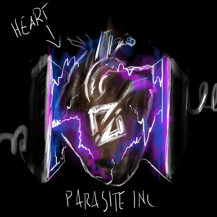
First image of including a heart in the concept.
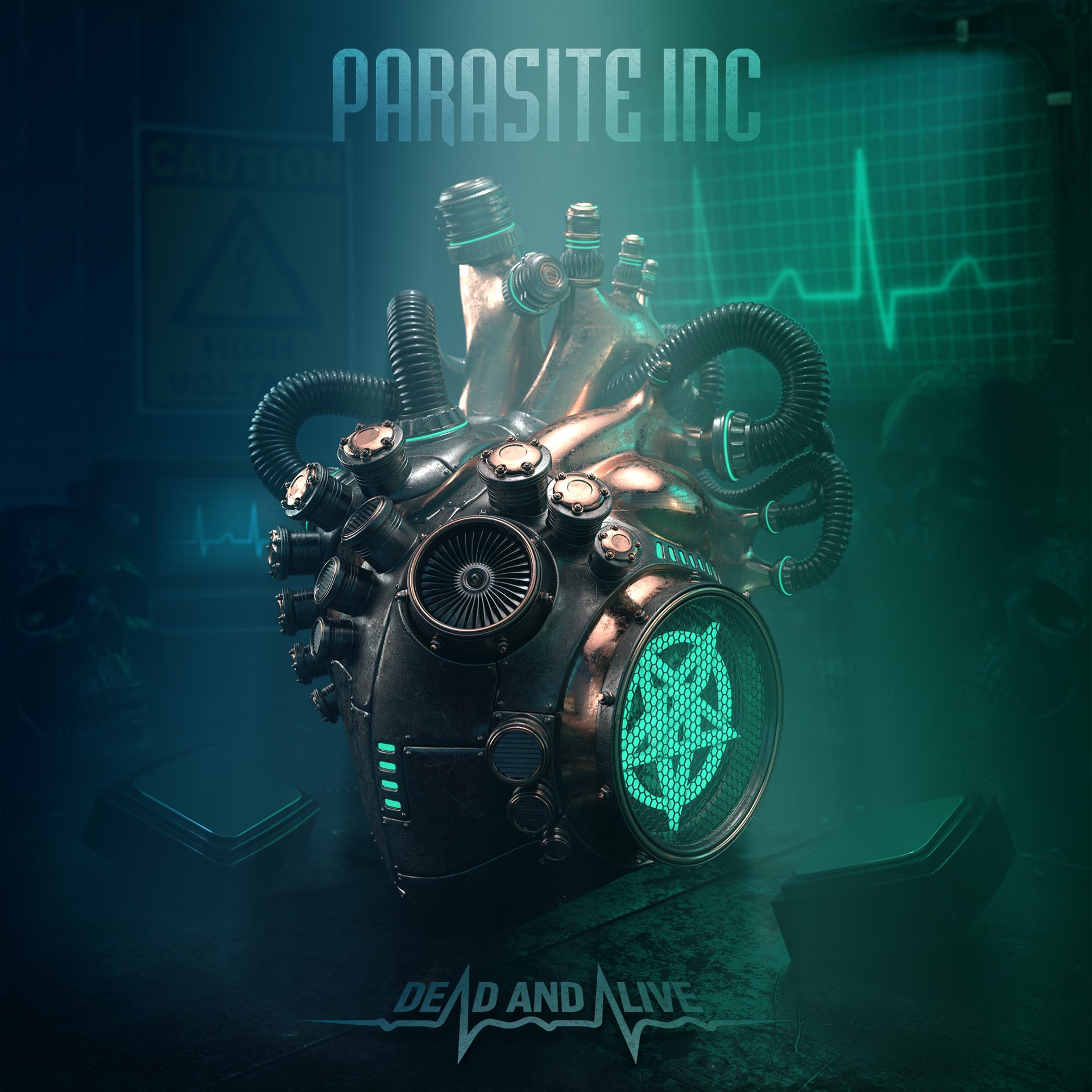
Anyway, as soon as we had the title nailed, things progressed a lot faster. Soon after the first concept drawing showing the two defibrillator pedals, Kai came up with a new draft, revealing a heart between those pedals, which pretty much is the idea of the final artwork: A dead heart which can be reanimated at any moment. So it’s somehow dead and alive at the same time.
The next step was quite logical: Most of our artwork and graphic design includes metallic objects. From cogwheels, iron plates to iron skulls, you can find a lot of elements like this in the artwork of “Time Tears Down”.
So, to keep those elements in the new artwork and since it also fits the “Dead and Alive” idea much better, the heart in the cover shouldn’t show a human heart but a robotic one (also human hearts are pretty scary, when you see them pump outside a human body. Search for human hearts on YouTube and you know what I mean!).
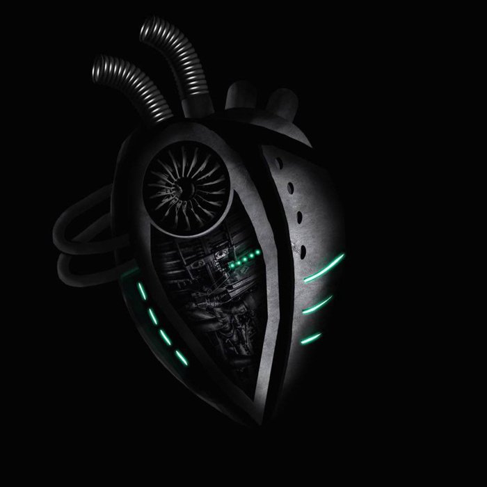
A draft Kai made to visualize the idea of a robotic heart.
From 2D to 3D
With the concept this far, I started to create all the elements of the artwork in 3D. The main reason we choose 3D over 2D is pretty simple: With a 3D scene, you’ll be able to change the perspective, the image ratio and pretty much everything on the fly without losing quality or details, if needed. And it allows to quickly and easily create nice wallpapers and other cool looking stuff later. The drawback of 3D is, that if it’s not done properly, it can quickly look pretty cheesy, so I was aiming for a style, which combines the look of a classic 2D drawn image with the benefits of having it in 3D.
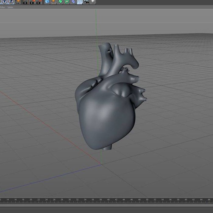
A human heart in 3D which was the basis for the robotic heart in the final cover.
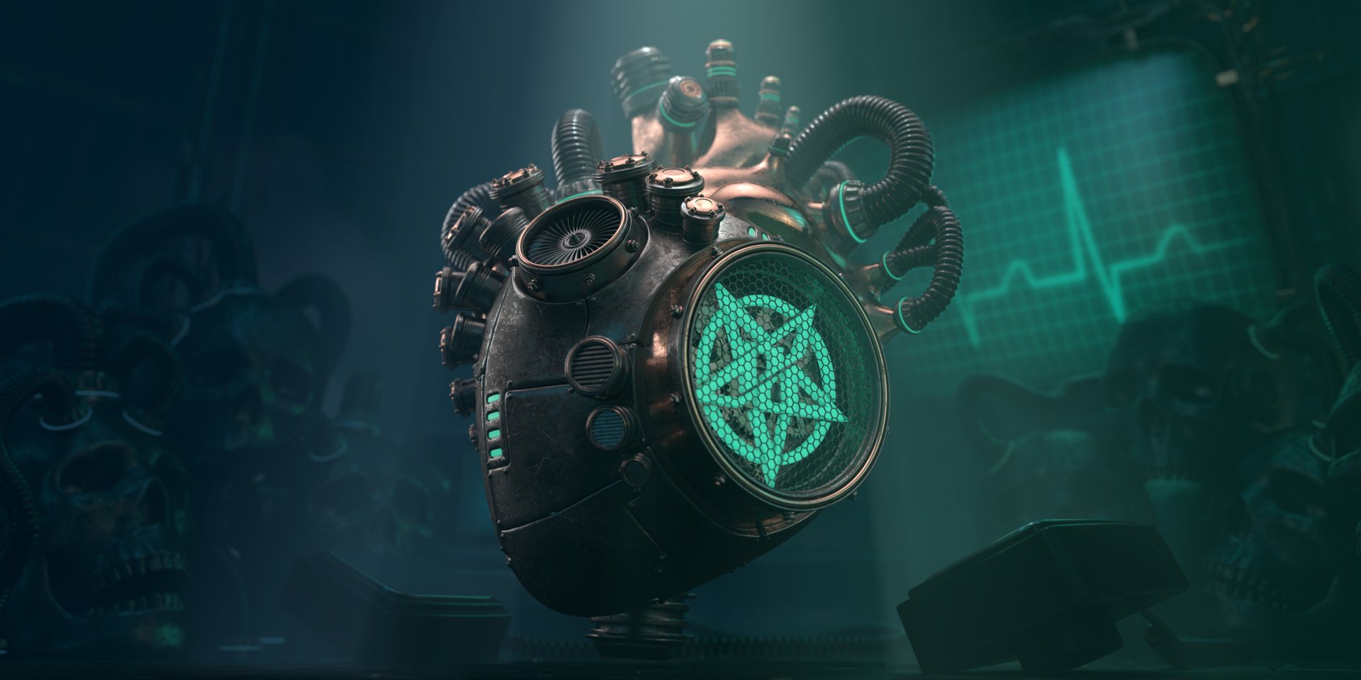
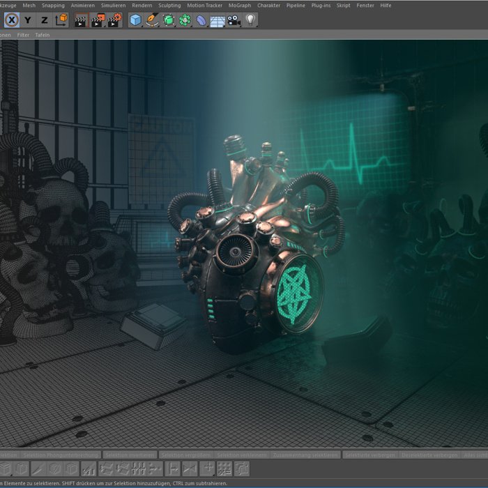
At this point, it just took weeks to bring everything together, haha. My biggest focus was, to make the robotic heart look really, really cool. I added more and more mechanical parts and details over the weeks and made the whole model animatable. My goal was, to make it look like it could be a fully functional robotic heart.
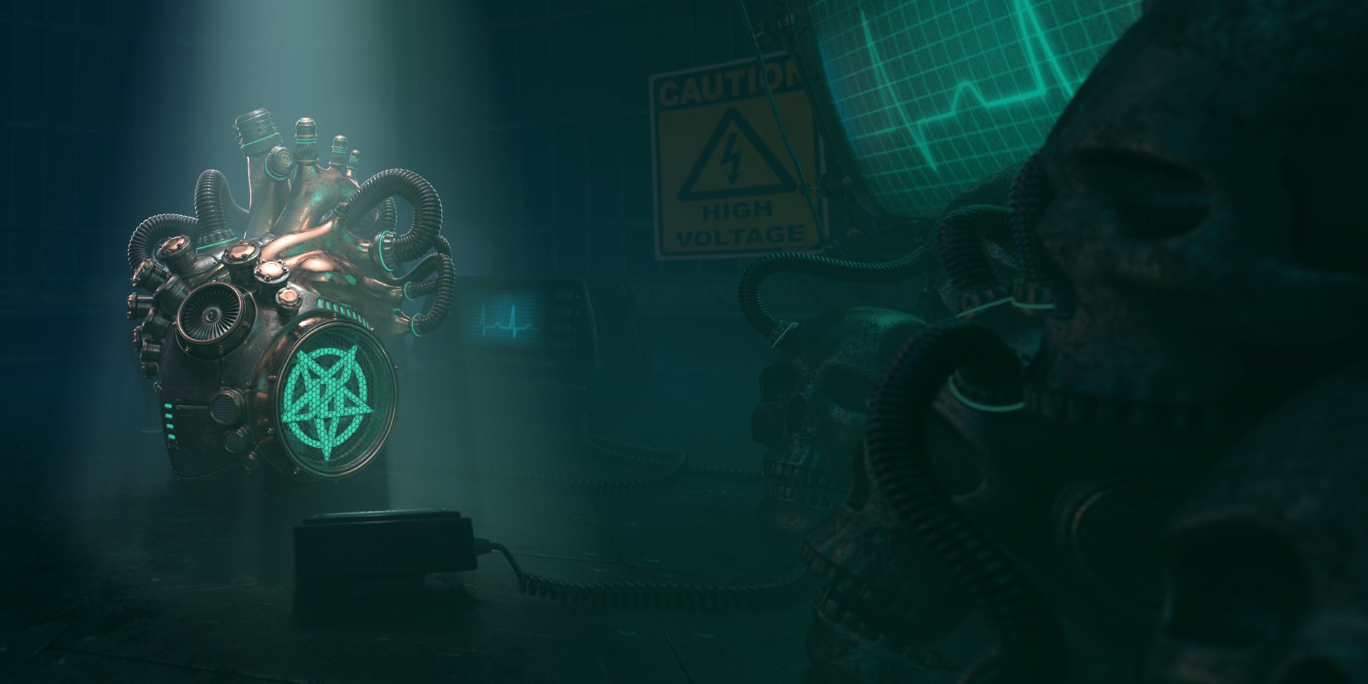
The scene around the heart should visualize some kind of cool looking laboratory, where the robotic heart was built, tested and – when finished – brought from “dead” to “alive” with an electric shock.
Final scene with a fade from wireframe to rendering.
The Result
After 300 hours it took the animation to render and about 4 to 5 hours per CD artwork/booklet picture, we had the final image pool to start working on putting everything together. And well, that’s the story behind our artwork and how it was developed from the first draft to final image.